여러분이 만약 디자이너라면, 아니면 디자인을 팔아야 하는 사람이라면 당신은 디자인을 어떻게 판매하십니까? 고객이 O.K 할 때까지 디자인을 바꾸고 바꿀 것입니까?
이러한 부문에 회의를 느끼고 있는 분들이라면, 관심이 있을만한 포스팅을 소개합니다.
그러나, 내용을 보고 있자면, 이러한 비용을 들여 설득하려니, 한번 더 디자인 하겠다는 생각이 들만도 하겠네요!
How To Communicate Design Decisions To Clients?
by Brian D. Armstrong
You may have noticed that in certain business and marketing circles there exists a “backlash” against the design community. Despite the rise of attractive, user-friendly solutions, in such circles unattractive designs have somehow managed to remain at the verge of acceptance. You’ll hear ideas being thrown around like “design is a waste of time — we have a really ugly site which outsells our competitors 3 to 1″ or “we are not worried about the design, we’ll outsource it or use a free WordPress theme, let us focus more on the product”.
You can almost sense a little bit of pride in how ugly their web-site is, or that they are treating design like a commodity. However off base these types of thoughts might be, there is clearly a lack of respect for designers in the business community at times. I’d like to address how you can shatter this barrier and talk to business folk in a language they understand.
This article provides you with 5 guidelines you can use as a designer to “speak business” — even if it’s just to get your foot in the door or land a big project.
1. Pretty doesn’t mean effective: statistics are your friend!
Designers like to show off portfolios. It can look stunning, but business people like to see numbers. What was the conversion rate on that opt in? What was the bounce rate and average time on site? What was the most clicked on link from the home page?
To a business person, “beautiful” or “visually stunning” are just a first step. They only really matter if “beautiful” or “visually stunning” turns into more sales. Probably the worst offender here is the classic “all flash” site that is gorgeous and completely impossible to use or update. Everything has a cost/benefit trade off, and that includes design.
Compare these two sites for a moment. The first is from 2Advanced Studios and includes some fancy animation.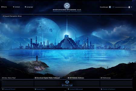
The second is from Perry Marshall, who sells a book on Google Adwords.
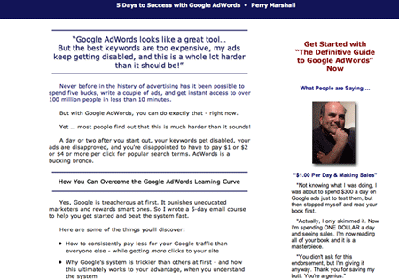
Despite being uglier, we can probably agree that Perry’s site is significantly better at getting new customers. It may not be better in other areas, but it all depends on what the goal of the site is. Speaking of which…
2. Every design should have a measurable goal
Saying that the goal is to “build the brand of XYZ” or “create an online presence” is basically meaningless to a business-minded person. A goal is only a goal if it is measurable.
What are some good examples of a measurable goal? Generating leads, making sales, number of phone calls, opt-ins, subscribers, incoming links, PageRank etc. Instead of trying to convince them that “attractive visual design of this sign-up form would attract more visitors” present them real numbers such as “in the past this design solution effectively increased the conversion rates by 35%”.
According to Luke Wroblewski’s findings in his book “Web Form Design: Filling in the Blanks”, one single design decision related to the design of sign-up forms has increased the conversion rates up to 40%.
Try saying to a business person: “we split tested this design, and A converted 21% of subscribers while B converted 38%, and our confidence interval on this data is very narrow”. Now you are speaking their language!
Try to get inside the head of a prospective customer. Imagine them with a burning pain or question, frantically clicking back and forth on the first page of Google results that came up. Realistically, they are making a decision whether to stick around or try the next result after scanning your site for about 1 second. This brings me to my next point…
3. Your site should have one clear path
As a customer comes to your site, you want to be in complete control of the 1st thing they see, the 2nd, the 3rd, and all the way down until they accomplish your goal that you’ve set. In other words, they have entered your sites “funnel” or “chute”.
Research results from an eye-tracking study: users satisfice — they click the first possible solution that is easily presented to them and may lead to their goal. Source.
The typical method of giving users lots of different options on a page has been tested and it doesn’t work as well. People don’t want to think hard to figure things out. Users satisfice — they want the first possible solution that is easily presented to them. You should be in control of things in every step of the way, and miraculous things happen when you start to think of your site as a set “process” instead of a maze of options.
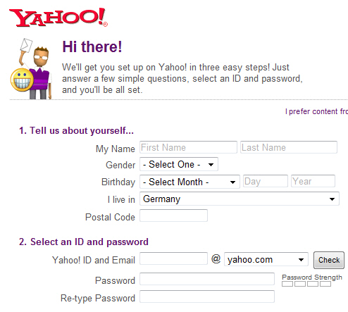
Please take a look at the first page of this site (the screenshot is displayed below). Really, go ahead and do it and then come back. I’ll wait.
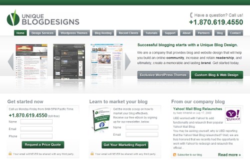
Well, so you looked right? Let me guess the exact order that your eyes went on the page. First you went to the top left for the site title and logo, then after flicking past the phone number for just an instant you went down to the main headline about “Successful blogging starts with…”. Finally, you skimmed the portfolio and then read the two sub-headlines “Get Started Now” and “Learn to market your blog”. Was I close?
Look at your own site and stand back 10 feet from your monitor. What still stands out on the screen? These are elements that can jump out, with contrast, negative space, etc to help you control where people’s eyes go. There is even some great research coming out on eye tracking. The point is that you can design with this information in mind to guide exactly how people experience your site for the first time and avoid trigger happy back-buttoners.
4. Remember the swiss army knife
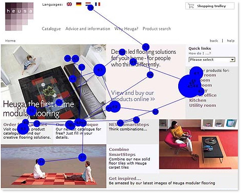
One of the best analogies I’ve ever heard about design came from Marissa Mayer at Google. She said that Google tries to think of its design like a Swiss army knife. It has tons of features neatly tucked away inside, but you don’t see them all at once. A first time user might come to the site and just the main knife is flipped open. It’s immediately clear what the main benefit and purpose of this thing is: it’s a knife. But for the advanced users, a little thumbnail catch is still visible so they can slowly start to pull out lesser used features when they’re needed.
Many people’s web-site are like a Swiss army knife with every damn tool in there pulled out and exposed. “What the hell is this site for?”, a first time visitor might wonder. And like that, you’ve lost them. They’ll check the next result on Google.
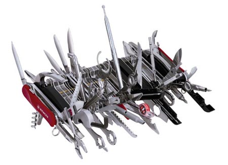
Think of an effective design like a Swiss army knife. It has tons of features neatly tucked away inside, but you don’t see them all at once. Source.
Keep the site simple with a clear path and purpose. Extra stuff on the page actually does have a detrimental effect in terms of confusion and distraction. Be adamant about eliminating unnecessary pieces of a design.
5. Provide performance metrics
Finally, if you really want to impress business people, put together a little report of how a design performs. It doesn’t have to be fancy — maybe a little spreadsheet (those business types do love Excel) with some basic metrics you can pull off of Google Analytics like visitors, time on site, most popular funnel path, and even a goal conversion rate.
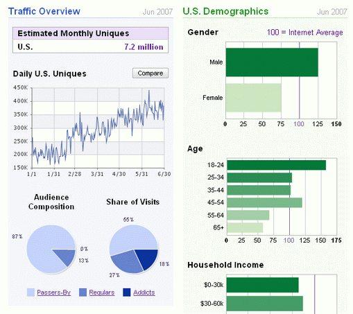
A spreadsheet with some basic metrics about like visitors, time on site, most popular funnel path, and even a goal conversion rate can make the difference. Example: Quantcast.
Just putting in a little bit of effort here will instantly distinguish you from all the other designers out there who would never think to do something like this. Whoever your client is will be much more likely to say to a colleague, “you know they just get it, they not only design but they understand the purpose behind what we’re doing, I really like that.” And boom, you’ve got a referral to grow to the next level.
Conclusion
This article may offend some designers. You may think it’s off topic, not your concern, or counterproductive to good design. That’s fine — take what works for you and leave the rest.
Speaking in a language the customer understands is key to good communication in any business. Whenever you get deep into a field and become an expert, it’s easy to lose sight of the fact that the rest of the world doesn’t think like you.
Take doctors for instance. They go through so much schooling and learn so much science that it literally sounds like they are speaking a different language if you see a group of them together. But when it comes time to talk to the patient and explain what’s wrong with them, they switch gears and speak in a language the customer understands.
As a great designer, you can do the same thing and become that much more effective in bringing value to your customers.
About the author
Brian Armstrong is an entrepreneur who also enjoys studying design. He writes about topics such as UI design, building web companies, and how to quit your 9-to-5 to work for yourself at his blog.